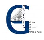
Explaining the Logo
What can the letter G hide inside it? The name of the program? Its purpose? Maybe its distinctive characteristics? Being the result of the collaborative brainstorming of Adamantia, Dimitris, Efi, Nikos, Fay, Mania, Nikos, Sofia and Theoni the logo seeks to embrace all these elements; even more than these.
First of all, the letter G represents the two basic words – primarily the two basic components – of the program “Greek in Greece”; the language, which is taught, and the place, where the program is held. Its blue color has been chosen precisely because of its association in the global imagery with the geolocated “Greek” (sky, sea). Its shiplike shape is reminiscent of sea travelling as the primordal way of exploration in both Ancient and Modern Greece.
The most distintinctive part of the logo is the six first letters of the alphabet, which form the mast as well as the sail of the ship. The purpose of this design is double; to represent visually through the choice of the six first letters of the Greek alphabet the focus and content of the program, i.e. the Greek-language study and to reveal another feature of the program, the important role of the UPatras buddies.
Overall, the G-ship visually exemplifies the constant immersive travelling of and for knowledge, language, people. The ship is ready, sail and mast are ready and we are ready to embark on a new journey. Will you be one of the travellers?
![]()

From page to digital